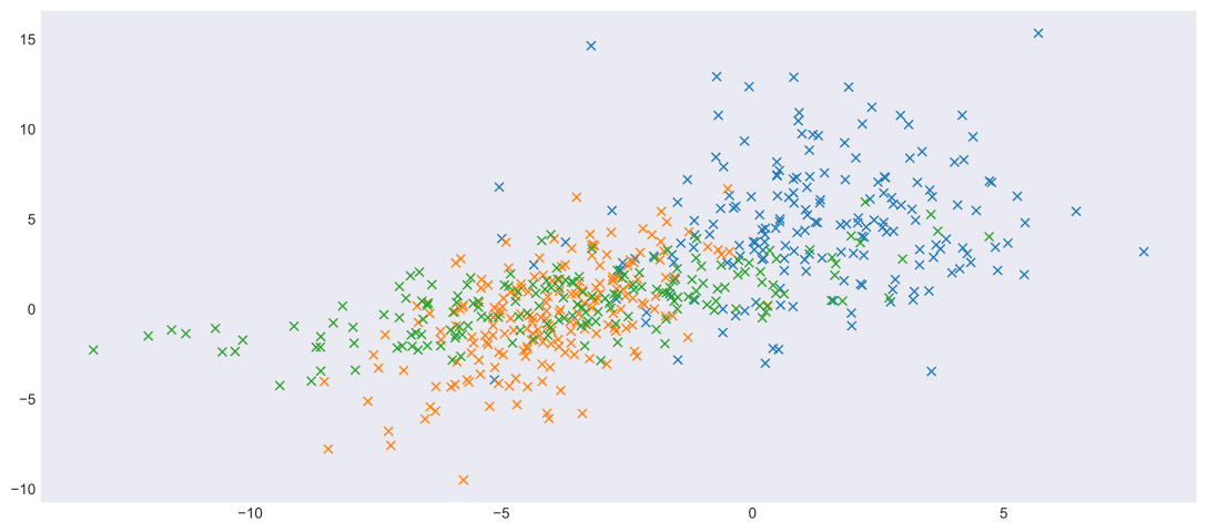
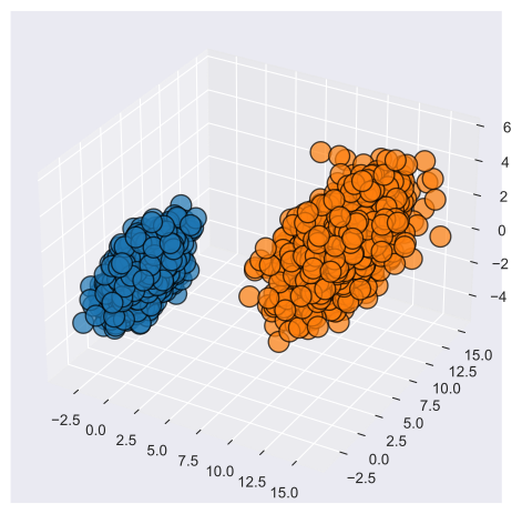
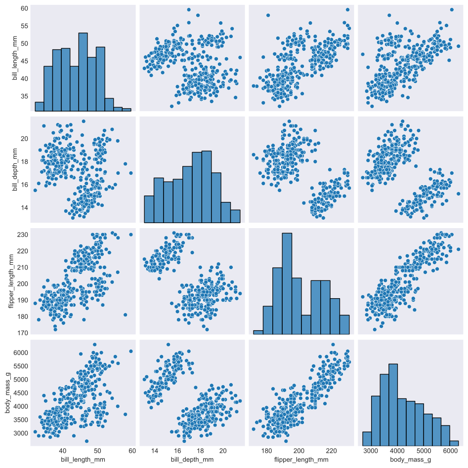
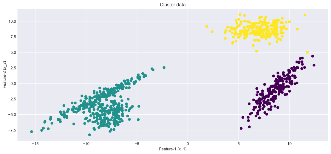
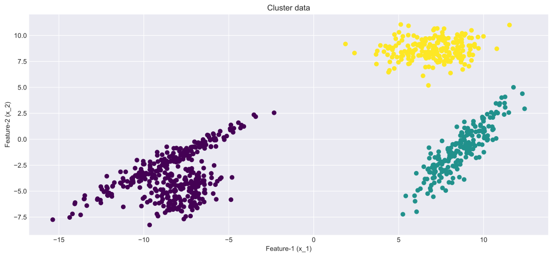
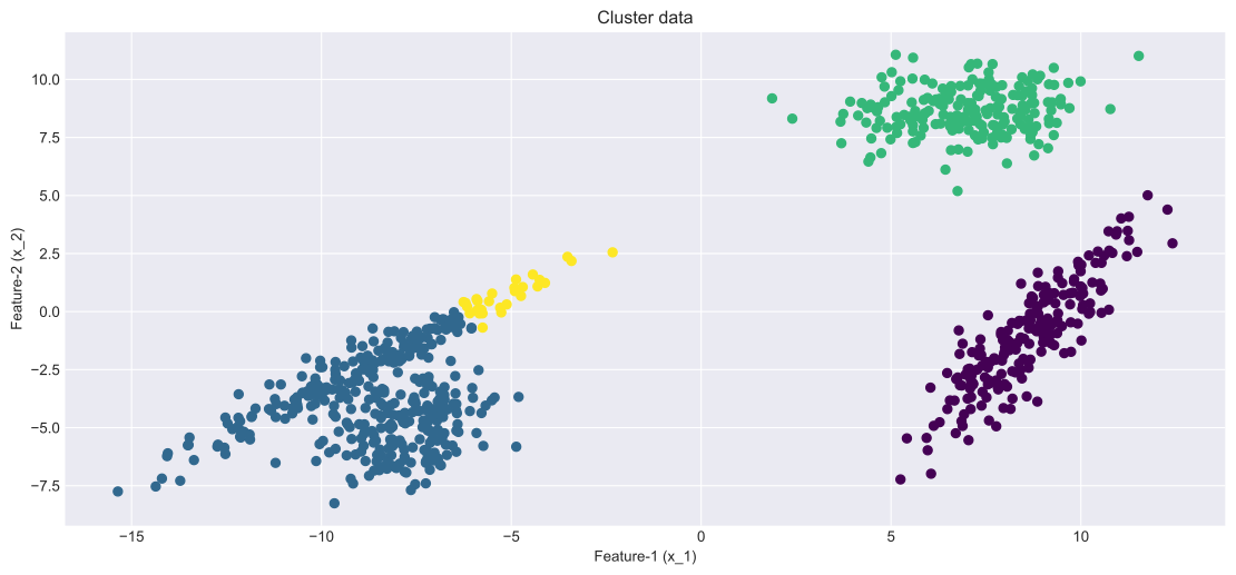
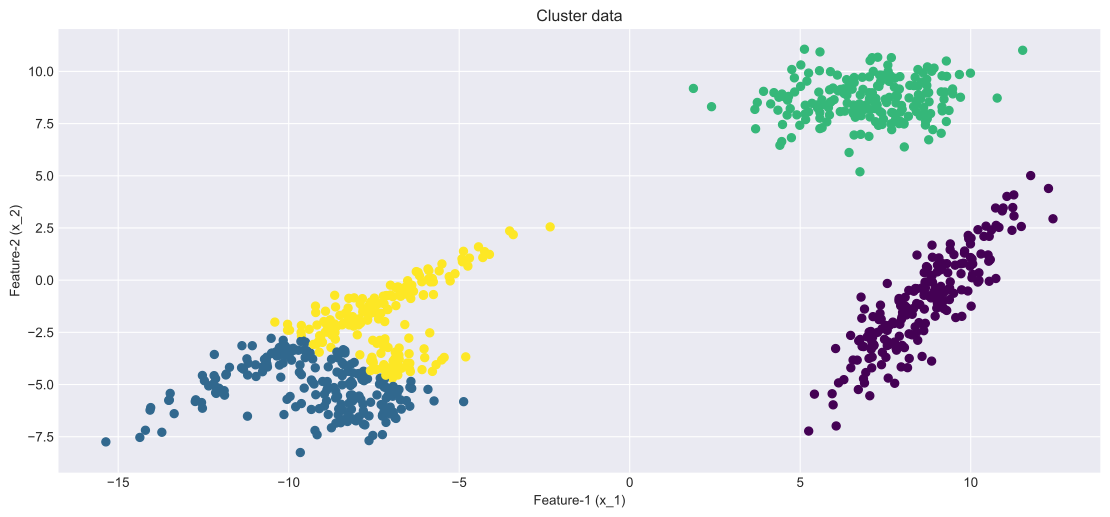
Data that forms into groups (i.e. clusters) in some feature space \(\mathbf X\) is typically the result of some data generating process.
Process is governed by some data generating probability density function (PDF) \(P(\mathbf X)\)
For example, consider a 2D feature space \(\mathbf x = (x_1, x_2)\).
In this space different cluster distributions arise by sampling data from different generating PDFs \[ C_1 \rightarrow P_1(x_1,x_2) \,\, , \,\,\ C_2 \rightarrow P_2(x_1,x_2) \,\, , \,\,\ \dots etc\]
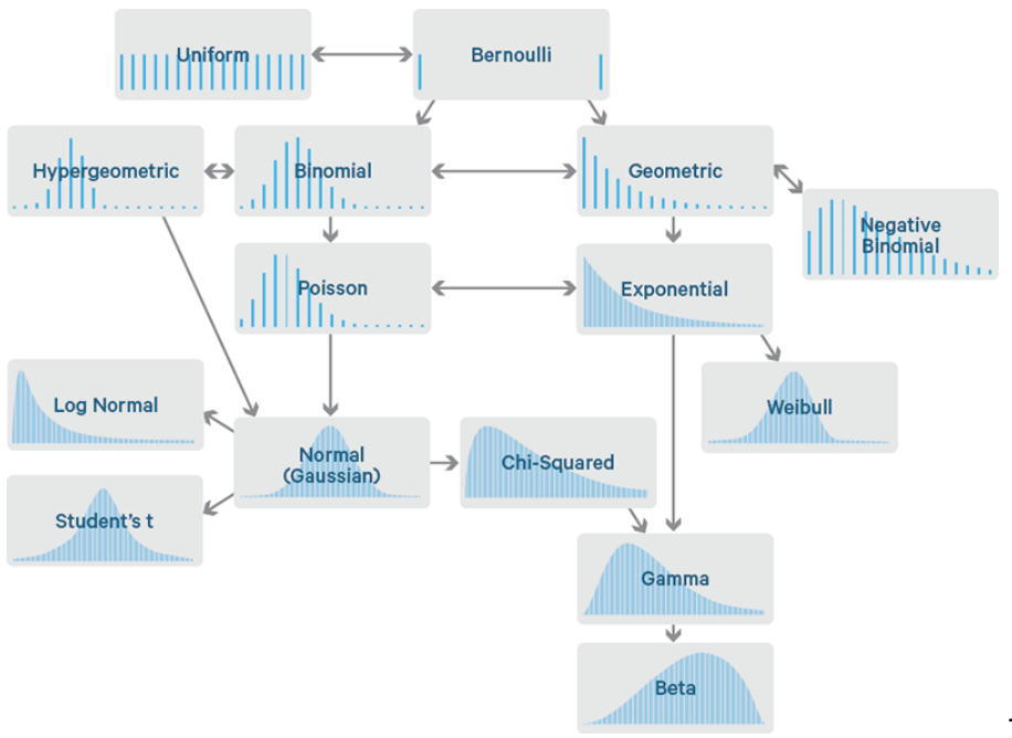
Common single-variable distributions
Examples of various common probability density functions
Single variable Gaussian
One of the most common probability distributions is the normal distribution
AKA the bell curve or normal distribution
If there is only one feature \(x\), then the Normal distribution PDF takes the following form \[ f(x)={\frac {1}{\sigma {\sqrt {2\pi }}}}e^{-{\frac {1}{2}}\left({\frac {x-\mu }{\sigma }}\right)^{2}} \leftarrow \text{two parameters: } \,\, (\mu, \sigma) \]
Normally distributed clusters: In many cases, clustering data arise from sampling from a normal distributions
Code: Single variable Gaussian
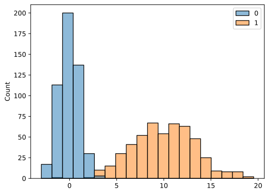
import numpy as npimport seaborn as snsimport pandas as pd import matplotlib.pyplot as plt# sns.set(rc={'figure.figsize':(11.7,8.27)})N=500C1=np.random.normal(loc=0.0, scale=1.0, size=(N,1))C2=np.random.normal(loc=10.0, scale=3.0, size=(N,1))sns.histplot(pd.DataFrame(np.hstack((C1,C2))),bins=20)plt.show()
Figure 1: The plot shows distinct groupings of data exhibiting bimodality due to the sampling from two different generating functions
Two-variable normal distribution
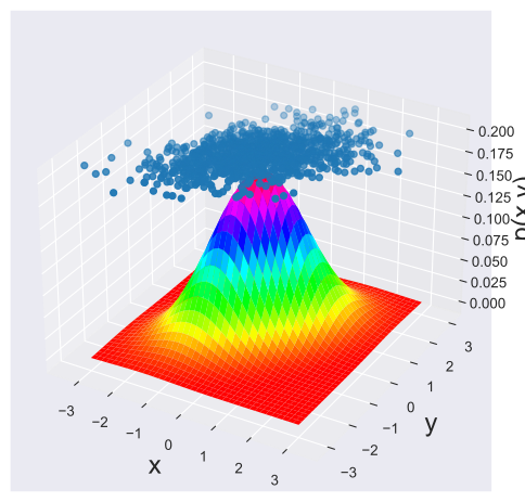
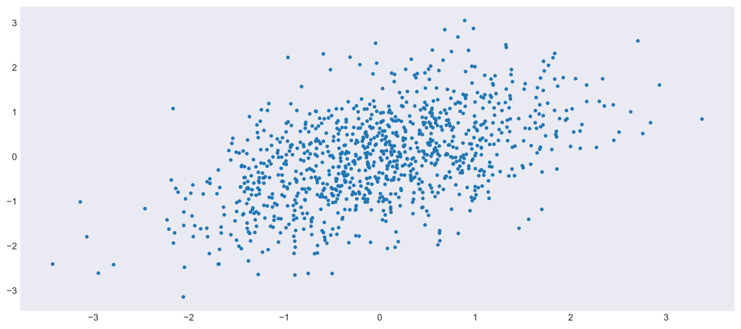
The normal distribution can be generalized to higher dimensional features spaces
Where \(\rho_{x,y}=\frac {\operatorname {cov} (x,y)}{\sigma _{x}\sigma _{y}}\) is the Pearson correlation coefficient
The function parameters are \(\mathbf{\mu} =\begin{pmatrix}\mu _{X} \\ \mu _{Y}\end{pmatrix}\) and \({\boldsymbol \Sigma }=\begin{pmatrix}\sigma _{X}^{2}&\rho \sigma _{X}\sigma _{Y}\\\rho \sigma _{X}\sigma _{Y}&\sigma _{Y}^{2}\end{pmatrix}\)
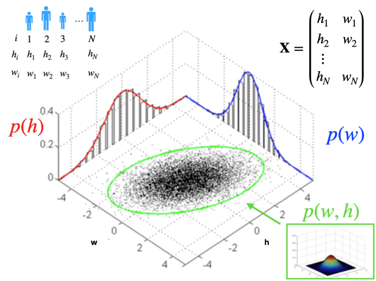
Visualization
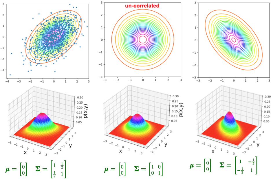
The following image shows a graphical representation of this concept
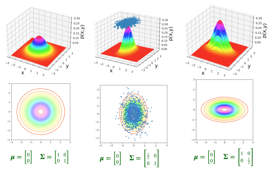
Parameterizations: Un-correlated
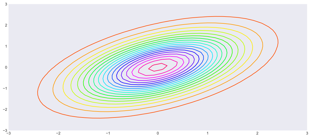
Example of various parametrizations of the un-correlated two-variable Gaussian distribution
Parameterizations: Correlated
Example of various parametrizations of the correlated two-variable Gaussian distribution
Code: Two-variable Gaussian-1
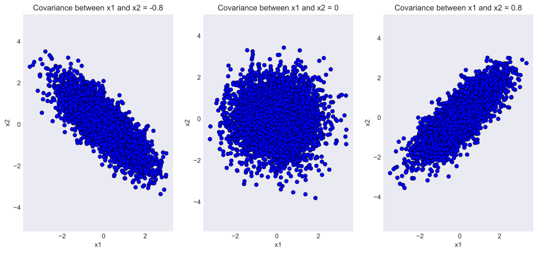
# Source: The code was modified from https://www.geeksforgeeks.org/visualizing-the-bivariate-gaussian-distribution-in-python/# Importing the necessary modulesimport numpy as npimport matplotlib.pyplot as pltfrom scipy.stats import multivariate_normalplt.style.use('seaborn-dark')plt.rcParams['figure.figsize']=14,6# Initializing the random seedrandom_seed=1000# List containing the variance# covariance valuescov_val = [-0.8, 0, 0.8]# Setting mean of the distributino to# be at (0,0)mean = np.array([0,0])# Iterating over different covariance# valuesfor idx, val inenumerate(cov_val): plt.subplot(1,3,idx+1)# Initializing the covariance matrix cov = np.array([[1, val], [val, 1]])# Generating a Gaussian bivariate distribution# with given mean and covariance matrix distr = multivariate_normal(cov = cov, mean = mean, seed = random_seed)# Generating 5000 samples out of the# distribution data = distr.rvs(size =5000)# Plotting the generated samples plt.plot(data[:,0],data[:,1], 'o', c='blue', markeredgewidth =0.5, markeredgecolor ='black') plt.title(f'Covariance between x1 and x2 = {val}') plt.xlabel('x1') plt.ylabel('x2') plt.axis('equal')plt.show()
/var/folders/0l/7994y9sn0l1d6cxc7lqc26p80000gn/T/ipykernel_90761/313323580.py:11: MatplotlibDeprecationWarning: The seaborn styles shipped by Matplotlib are deprecated since 3.6, as they no longer correspond to the styles shipped by seaborn. However, they will remain available as 'seaborn-v0_8-<style>'. Alternatively, directly use the seaborn API instead.
  plt.style.use('seaborn-dark')
anti-correlated, un-correlated, positively correlated normally distributed data
/var/folders/0l/7994y9sn0l1d6cxc7lqc26p80000gn/T/ipykernel_90761/4137205603.py:21: FutureWarning: The default value of numeric_only in DataFrame.corr is deprecated. In a future version, it will default to False. Select only valid columns or specify the value of numeric_only to silence this warning.
  corr1 = d1.corr()
Non-Gaussian clusters
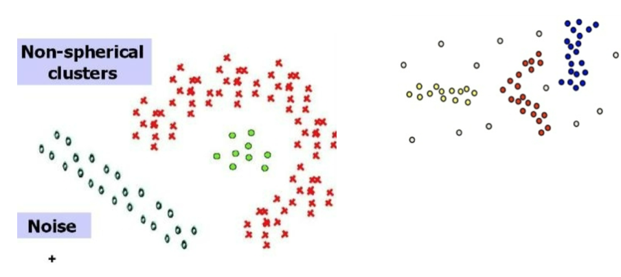
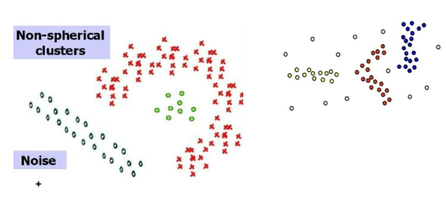
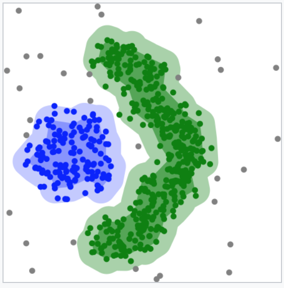
It is important to emphasize that NOT all clusters are normally distributed
Source: Introduction to Data Mining (Second Edition) (Vipin Kumar) https://www-users.cse.umn.edu/~kumar001/dmbook/index.php
Unsupervised learning
Introduction to Unsupervised machine learning
Supervision
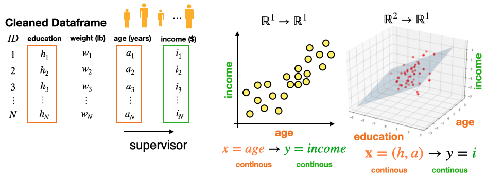
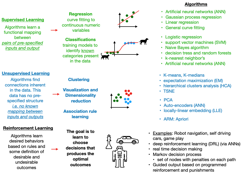
Supervised case-1 (regression): A supervisor has identified a relationship in the data between some numerical inputs \(X\) and some numerical targets.
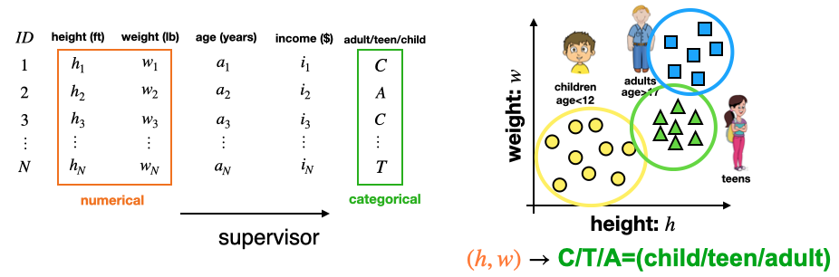
Supervised case-2 (classification): A supervisor has isolated a relationship in the data between some Numerical inputs \(X\) and some categorical targets \(y\) (i.e. labels)
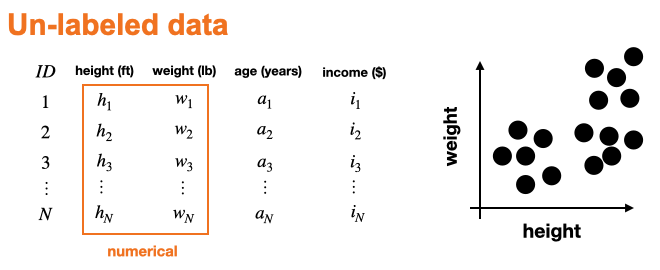
Un-supervised case: There are NO KNOWN labels or mappings are present in the data.
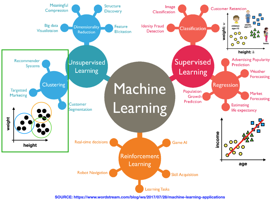
Machine learning categories
Un-supervised learning:
Typically when doing unsupervised learning (i.e. clustering or dimensionality reduction) you DO NOT know if any relevant mappings (relationships) in the data.
In this case, there is NO KNOWN “target” space \(Y\) w/ the “ground truth” labels (targets).
Instead, you have some features space \(\mathbf X\) and you are trying to systematically figure out if the data in that space forms groups (clusters).
This “un-labeled” nature of the data-set is what makes it “unsupervised”.
It is possible to already have some categorical labels in your data before clustering. In this case, the clustering algorithm may or may-not find clusters corresponding to the existing labels.
If it finds new labels, this suggests that there may be unknown groups in the data which are NOT associated with the existing labels.
ML Algorithms
Clustering
Introduction to clustering analysis
What is clustering?
Clustering is an unsupervised learning technique.
The data is not labeled or do not specify a given class.
Goal:
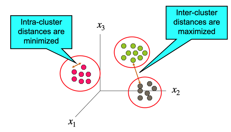
Discover clusters or groups within the data that are similar
Find groups (i.e. clusters), based on some notion of similarity or distance in a feature space \(X\) , such that elements in the same cluster are more similar to each other than they are to elements in different clusters).
Motivation
Why Cluster Data?
Group related items to reveal internal structure of the data
Knowledge discovery during EDA (i.e. pattern identification)
Subset selection: Reduce the size of large data sets by considering sub-sets (US –> PA, NY, DC, … etc)
Typical Clustering Objectives
Find the number of clusters
Find the number of points within each cluster
Find the distance of objects within each cluster
Find the distance between different clusters
Find the density of points within a cluster
What is NOT Cluster Analysis?
Supervised classification
The training data have labels or classes so that the classification method can “learn” how to classify new data into the correct group.
Simple segmentation
Creating groups based on a feature.
Dividing students into different registration groups alphabetically by last name: Group A, Group B, etc…
Results of a query
Groupings are a result of an external specification – the groups are pre-defined.
What is a cluster?
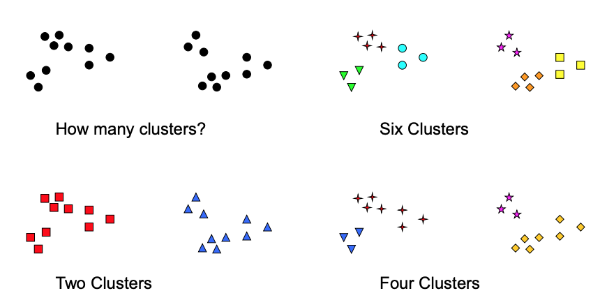
This question is ambiguous and subjective & often clusters are not well defined
Clustering results require more “scrutiny” than supervised results
Source: Introduction to Data Mining (Second Edition) (Vipin Kumar) https://www-users.cse.umn.edu/~kumar001/dmbook/index.php
Separation & Exclusivity
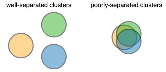
Separation
Exclusivity
Exclusive - Assigns each data point to a single cluster
Non-exclusive - A data point can be a member of more than one cluster
Search space size
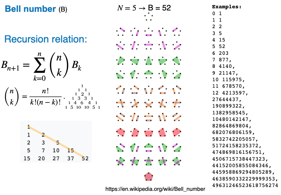
The number of possible clusters (increases extremely fast w/ the number of data points)
The problem is computationally difficult (NP-hard)
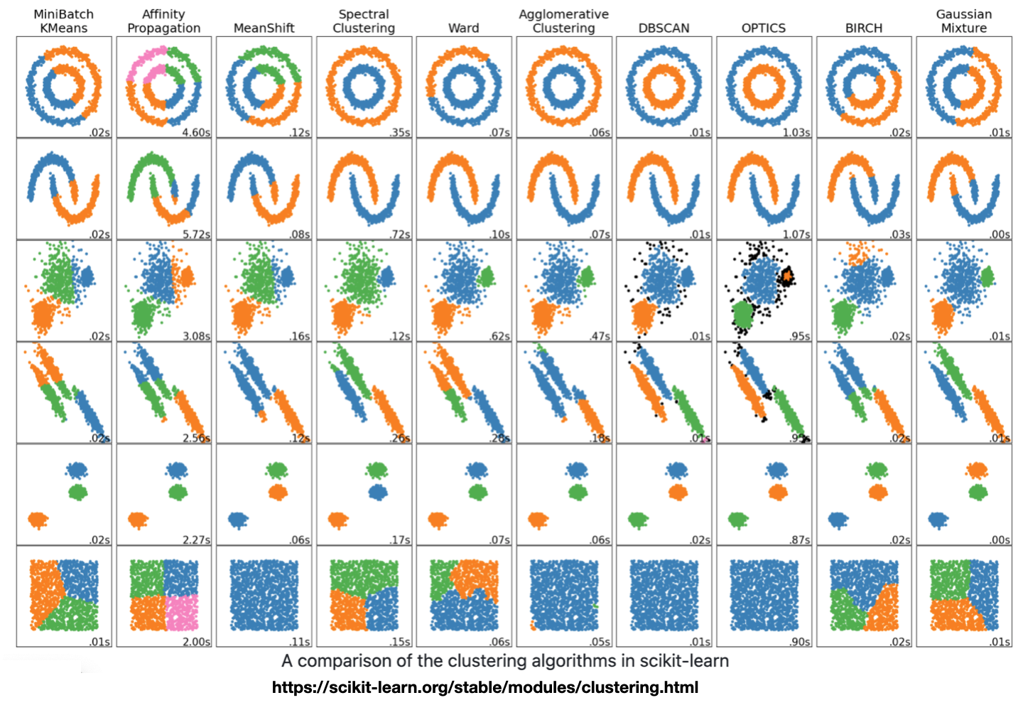
Algorithm result comparison
Hierarchical vs. Partitional
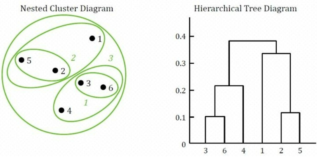
An important difference between certain clustering methods is whether the set of clusters are nested or not.
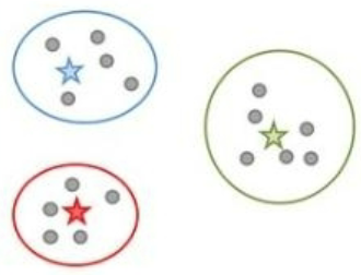
Partitional clustering:
a division of the set of data into non-overlapping clusters.
k means – creates k partitions or clusters
Each data point is in exactly one cluster.
Hierarchical clustering:
nested clustered, organized like a tree.
Does not assume a value of k (unlike k-means)
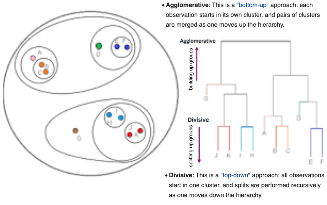
Hierarchical: Agglomerative vs Division
Agglomerative (bottom up): Each observation starts in its own cluster, and pairs of clusters are merged as one moves up the hierarchy.
Division (top down): All observations start in one cluster, and splits are performed recursively as one moves down the hierarchy.
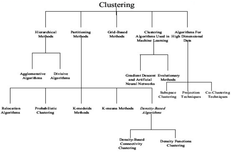
Clustering algorithm summary
K-Means clustering
Introduction:
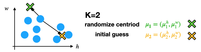
Centroid based cluster identification
The center of a cluster is often called a centroid
This can be computed using centrality measures associated with the distribution of the data features \(\mathbf x= x_1,x_2 ... x_N\)
e.g. (mean, median, or mode)
It is helpful to think of the centroid as the most “representative” point of a cluster.
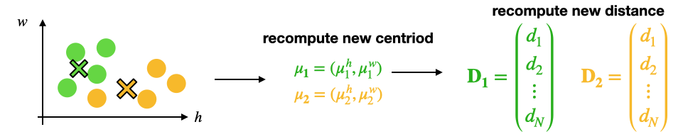
You can associate a point to a cluster with the nearest centroid, which is what is done in K-means
This is known as Prototype-based clustering
A cluster is a set of objects such that an object in a cluster is closer (more similar) to the prototype or “center” of a cluster, than to the center of any other cluster Source: Introduction to Data Mining (Second Edition) (Vipin Kumar) https://www-users.cse.umn.edu/~kumar001/dmbook/index.php
Overview
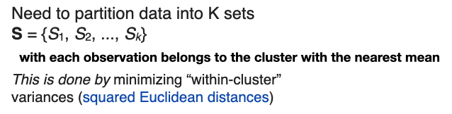
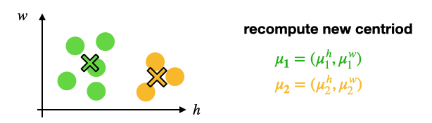
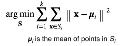
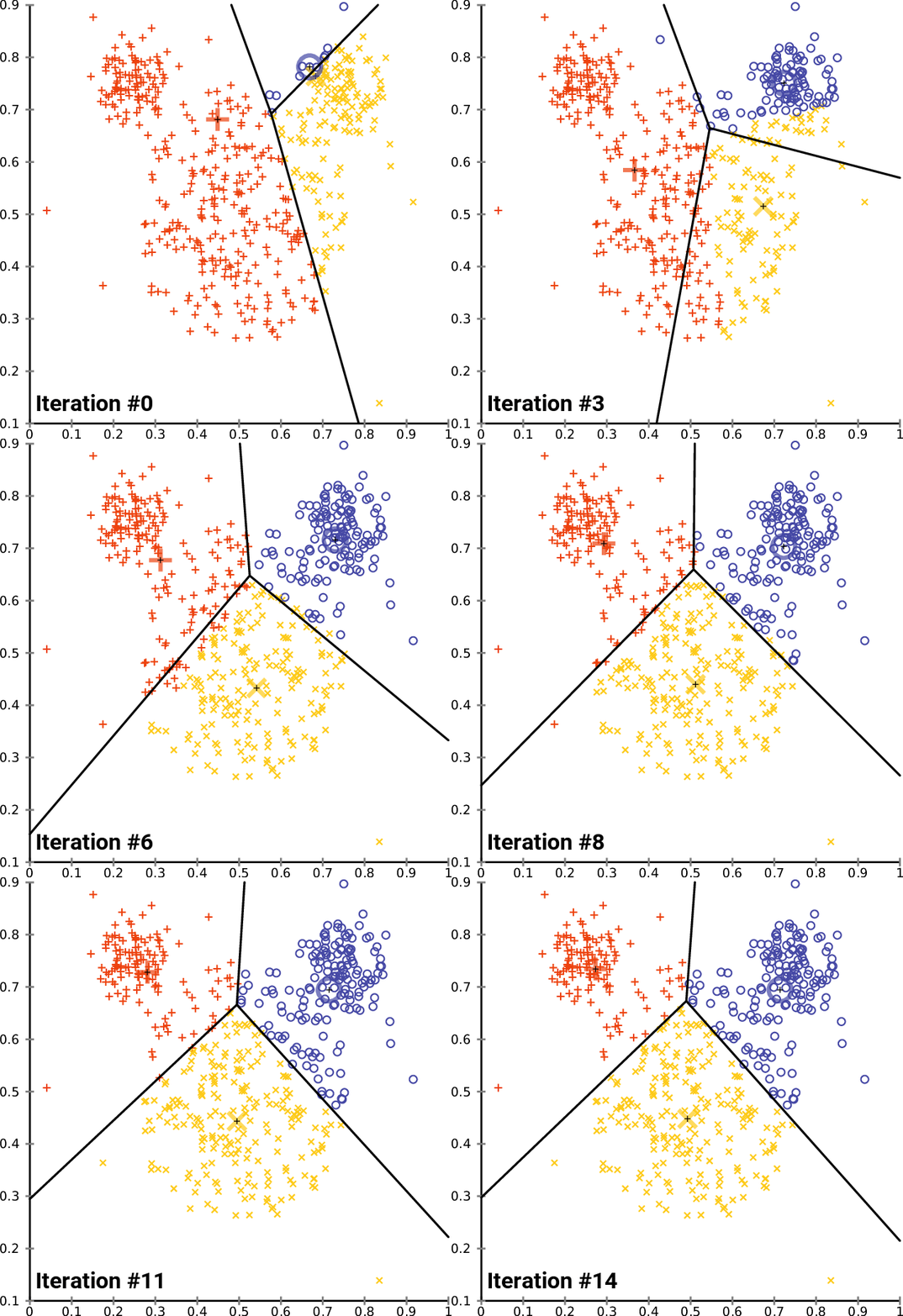
k-means clustering is a method of vector quantization, that aims to partition n observations into k clusters in which each observation belongs to the cluster with the nearest mean (cluster centers or cluster centroid)
This centroid serves as a prototype of the cluster.
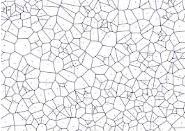
This results in a partitioning of the data space into Voronoi cells.
K-means clustering minimizes within-cluster variances (squared Euclidean distances), but not regular Euclidean distances,
the mean optimizes squared errors, whereas only the geometric median minimizes Euclidean distances.
For instance, better Euclidean solutions can be found using k-medians and k-medoids. Source: (https://en.wikipedia.org/wiki/K-means_clustering)
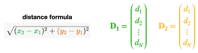
Pairwise distances (review)
Typically, the main ingredient for data clustering is a similarity or difference measure between the data points.
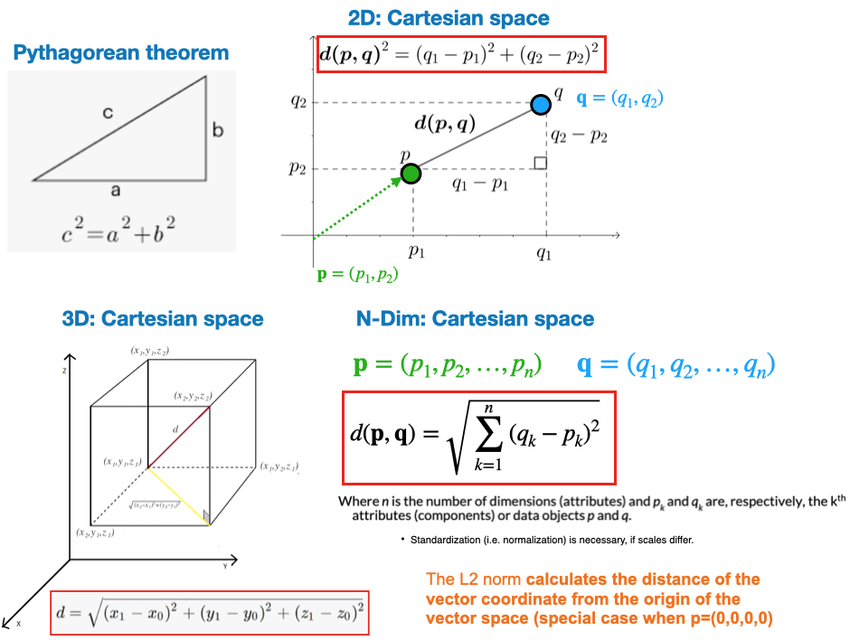
L2: Euclidean distance.
Pairwise distances (review)
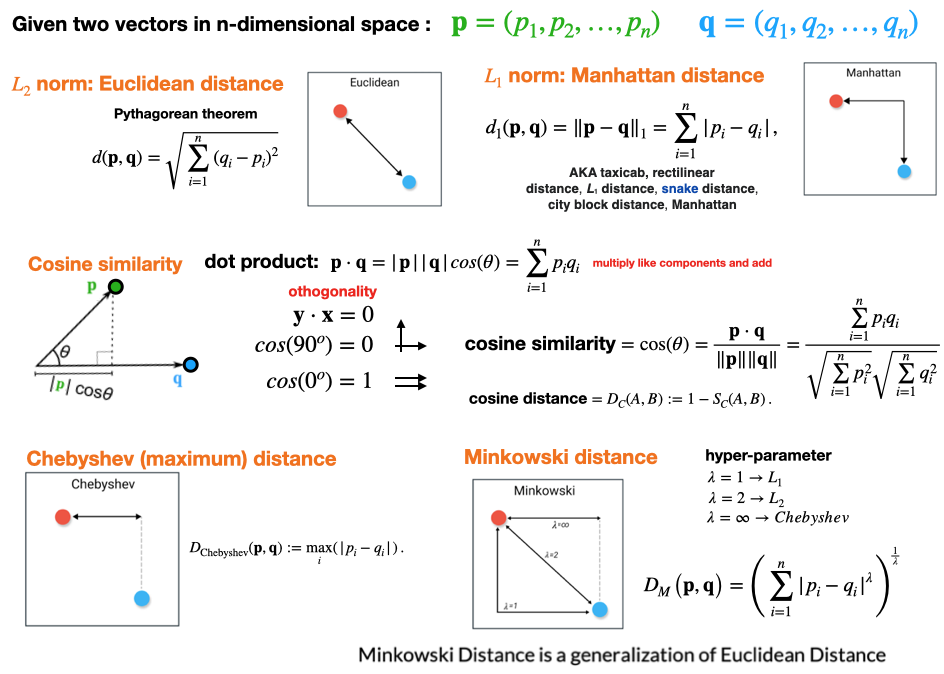
Alternative metrics.
Algorithm
The k-means problem is solved using either Lloyd’s or Elkan’s algorithm.
In practice, the k-means algorithm is very fast (one of the fastest clustering algorithms available), but it falls in local minima.
That’s why it can be useful to restart it several times ## Goal
The number of clusters to form as well as the number of centroids to generate.
init
Method for initialization:
‘random’: choose n_clusters observations (rows) at random from data for the initial centroids.
‘k-means++’ : selects initial cluster centroids using sampling based on an empirical probability distribution of the points’ contribution to the overall inertia
n_init
Number of time the k-means algorithm will be run with different centroid seeds.
The final results will be the best output of n_init consecutive runs in terms of inertia.
Elbow method is a technique used to determine the optimal number of clusters in a clustering algorithm, typically applied in K-means clustering.
Fit the clustering algorithm (e.g., K-means) to the dataset with a range of possible cluster numbers (k).
For each value of k, calculate the sum of squared distances (SSD) between data points and their assigned cluster centroids.
Plot the SSD values for different k values.
Look for an “elbow” point on the plot, where the SSD begins to level off. This is the point where adding more clusters doesn’t significantly reduce the SSD.
The number of clusters at the “elbow” point is considered the optimal choice for the problem.
It helps strike a balance between model complexity and data fitting.
The goal is to find the value of k that represents a meaningful structure in the data without over-segmenting or under-segmenting the dataset.
Elbow method
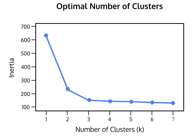
Inertia: Sum of squared distances of samples to their closest cluster center
weighted by the sample weights if provided
This measures how well a dataset was clustered by K-Means.
A good model is one with low inertia AND a low number of clusters (K).
However, this is a tradeoff because as K increases, inertia decreases.
To find the optimal K for a dataset, use the Elbow method; find the point where the decrease in inertia begins to slow.
K=3 is the “elbow” of this graph. Source: https://www.codecademy.com/learn/machine-learning/modules/dspath-clustering/cheatsheet
Silhouette method
The silhouette method is a technique used to evaluate the quality of clustering in unsupervised learning.
For each data point, calculate its silhouette score, which measures how similar it is to its own cluster compared to other clusters.
The silhouette score ranges from -1 (poor clustering) to +1 (well-separated clusters). A score near 0 suggests overlapping clusters.
Calculate the average silhouette score for all data points in the dataset.
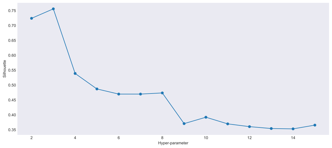
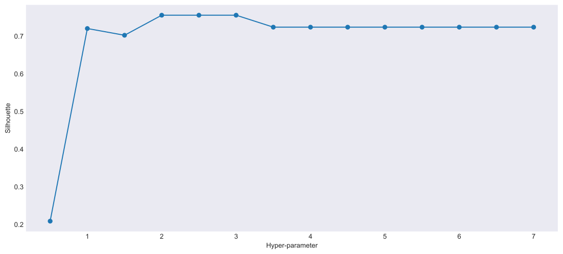
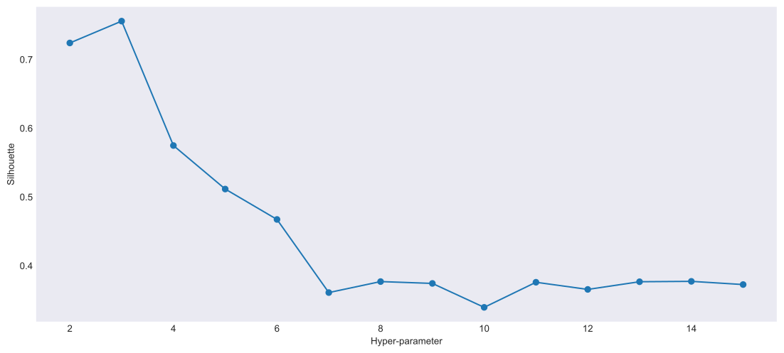
Repeat the steps for different numbers of clusters (k) & compare the silhouette scores.
Choose the number of clusters (k) that maximizes the average silhouette score.
Higher silhouette scores indicate better-defined clusters, making it a useful method for cluster validation and selection.
Silhouette method
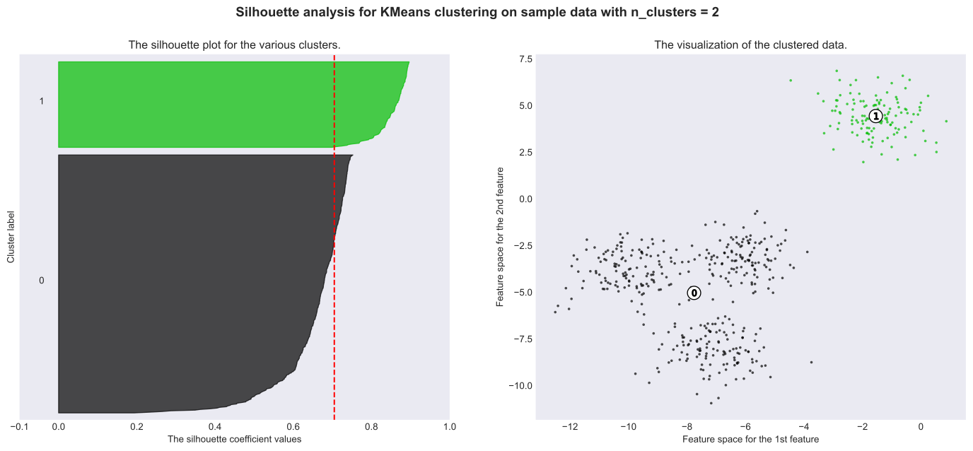
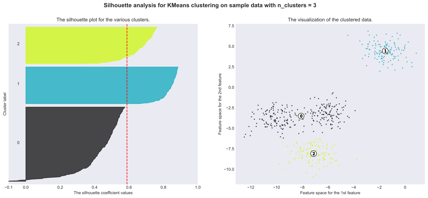
Silhouette analysis is used to study separation distance between the resulting clusters.
The silhouette plot displays a measure of how close each point in one cluster is to points in the neighboring clusters.
It provides a way to assess parameters like number of clusters visually.
Silhouette coefficients
This measure has a range of [-1, 1].
+1 indicate that the sample is far away from the neighboring clusters
0 indicates that the sample is on or very close to the decision boundary between two neighboring clusters
negative values indicate that those samples may be assigned to the wrong cluster. Source: https://www.codecademy.com/learn/machine-learning/modules/dspath-clustering/cheatsheet
Extra
Code examples
Code: Cluster generation function
import numpy as npimport matplotlib.pyplot as pltimport sklearn
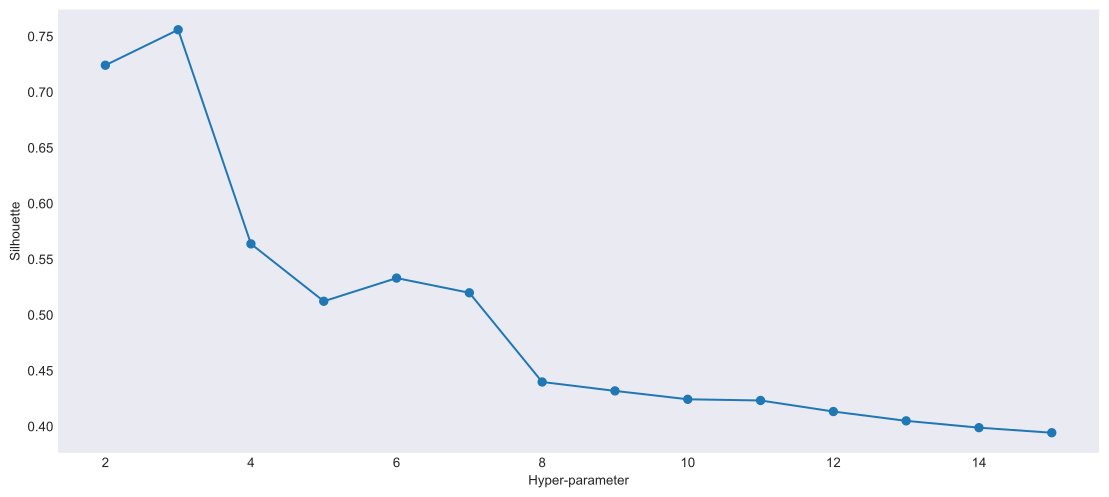
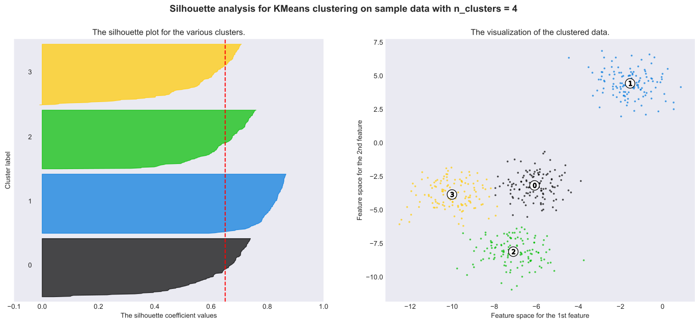
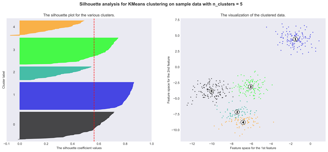
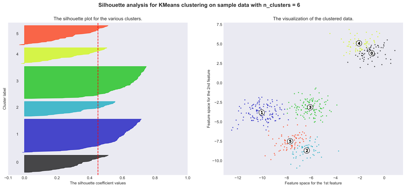
Bad choices: 3, 5 and 6 are a bad pick (below average silhouette scores)
Better choices: Silhouette analysis is more ambivalent in deciding between 2 and 4, however, 4 appears to be better.
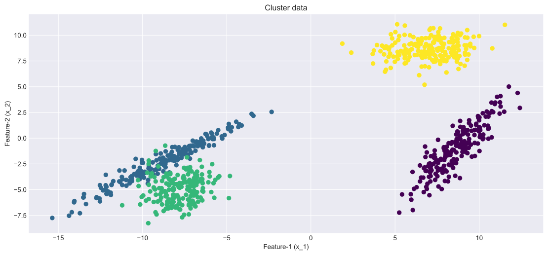
# SOURCE: https://scikit-learn.org/stable/auto_examples/cluster/plot_kmeans_silhouette_analysis.htmlfrom sklearn.datasets import make_blobsfrom sklearn.cluster import KMeansfrom sklearn.metrics import silhouette_samples, silhouette_scoreimport matplotlib.pyplot as pltimport matplotlib.cm as cmimport numpy as np# Generating the sample data from make_blobs# This particular setting has one distinct cluster and 3 clusters placed close# together.X, y = make_blobs( n_samples=500, n_features=2, centers=4, cluster_std=1, center_box=(-10.0, 10.0), shuffle=True, random_state=1,) # For reproducibilityrange_n_clusters = [2, 3, 4, 5, 6]for n_clusters in range_n_clusters:# Create a subplot with 1 row and 2 columns fig, (ax1, ax2) = plt.subplots(1, 2) fig.set_size_inches(18, 7)# The 1st subplot is the silhouette plot# The silhouette coefficient can range from -1, 1 but in this example all# lie within [-0.1, 1] ax1.set_xlim([-0.1, 1])# The (n_clusters+1)*10 is for inserting blank space between silhouette# plots of individual clusters, to demarcate them clearly. ax1.set_ylim([0, len(X) + (n_clusters +1) *10])# Initialize the clusterer with n_clusters value and a random generator# seed of 10 for reproducibility. clusterer = KMeans(n_clusters=n_clusters, random_state=10) cluster_labels = clusterer.fit_predict(X)# The silhouette_score gives the average value for all the samples.# This gives a perspective into the density and separation of the formed# clusters silhouette_avg = silhouette_score(X, cluster_labels)print("For n_clusters =", n_clusters,"The average silhouette_score is :", silhouette_avg, )# Compute the silhouette scores for each sample sample_silhouette_values = silhouette_samples(X, cluster_labels) y_lower =10for i inrange(n_clusters):# Aggregate the silhouette scores for samples belonging to# cluster i, and sort them ith_cluster_silhouette_values = sample_silhouette_values[cluster_labels == i] ith_cluster_silhouette_values.sort() size_cluster_i = ith_cluster_silhouette_values.shape[0] y_upper = y_lower + size_cluster_i color = cm.nipy_spectral(float(i) / n_clusters) ax1.fill_betweenx( np.arange(y_lower, y_upper),0, ith_cluster_silhouette_values, facecolor=color, edgecolor=color, alpha=0.7, )# Label the silhouette plots with their cluster numbers at the middle ax1.text(-0.05, y_lower +0.5* size_cluster_i, str(i))# Compute the new y_lower for next plot y_lower = y_upper +10# 10 for the 0 samples ax1.set_title("The silhouette plot for the various clusters.") ax1.set_xlabel("The silhouette coefficient values") ax1.set_ylabel("Cluster label")# The vertical line for average silhouette score of all the values ax1.axvline(x=silhouette_avg, color="red", linestyle="--") ax1.set_yticks([]) # Clear the yaxis labels / ticks ax1.set_xticks([-0.1, 0, 0.2, 0.4, 0.6, 0.8, 1])# 2nd Plot showing the actual clusters formed colors = cm.nipy_spectral(cluster_labels.astype(float) / n_clusters) ax2.scatter( X[:, 0], X[:, 1], marker=".", s=30, lw=0, alpha=0.7, c=colors, edgecolor="k" )# Labeling the clusters centers = clusterer.cluster_centers_# Draw white circles at cluster centers ax2.scatter( centers[:, 0], centers[:, 1], marker="o", c="white", alpha=1, s=200, edgecolor="k", )for i, c inenumerate(centers): ax2.scatter(c[0], c[1], marker="$%d$"% i, alpha=1, s=50, edgecolor="k") ax2.set_title("The visualization of the clustered data.") ax2.set_xlabel("Feature space for the 1st feature") ax2.set_ylabel("Feature space for the 2nd feature") plt.suptitle("Silhouette analysis for KMeans clustering on sample data with n_clusters = %d"% n_clusters, fontsize=14, fontweight="bold", )plt.show()
For n_clusters = 2 The average silhouette_score is : 0.7049787496083262
For n_clusters = 3 The average silhouette_score is : 0.5882004012129721
For n_clusters = 4 The average silhouette_score is : 0.6505186632729437
For n_clusters = 5 The average silhouette_score is : 0.56376469026194
For n_clusters = 6 The average silhouette_score is : 0.4504666294372765